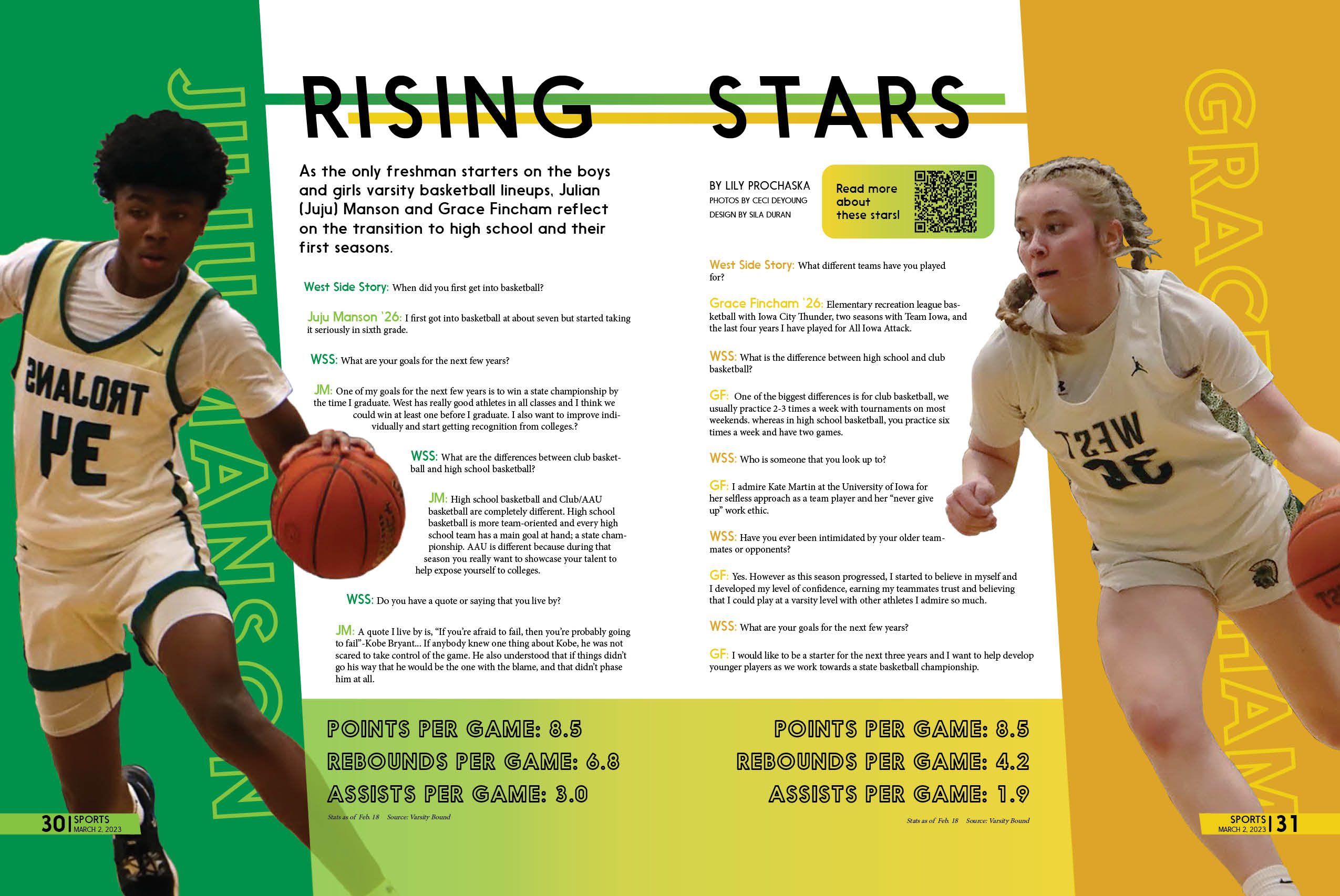
Rising Stars
West Side Story Volume 55 Issue 4, March 2, 2023
I wanted to create an engaging and dynamic design that will get every readers’ attention. I did this through using slanted shapes, words, and lines to highlight and emphasize the movement and adrenaline of the players captured in their action photos.
Also playing off of our school colors– green and gold– is a must.
Additionally, I got the chance to recreate this sense of movement something dynamic in the infographics and photo feature I made for our website, which can be viewed here.
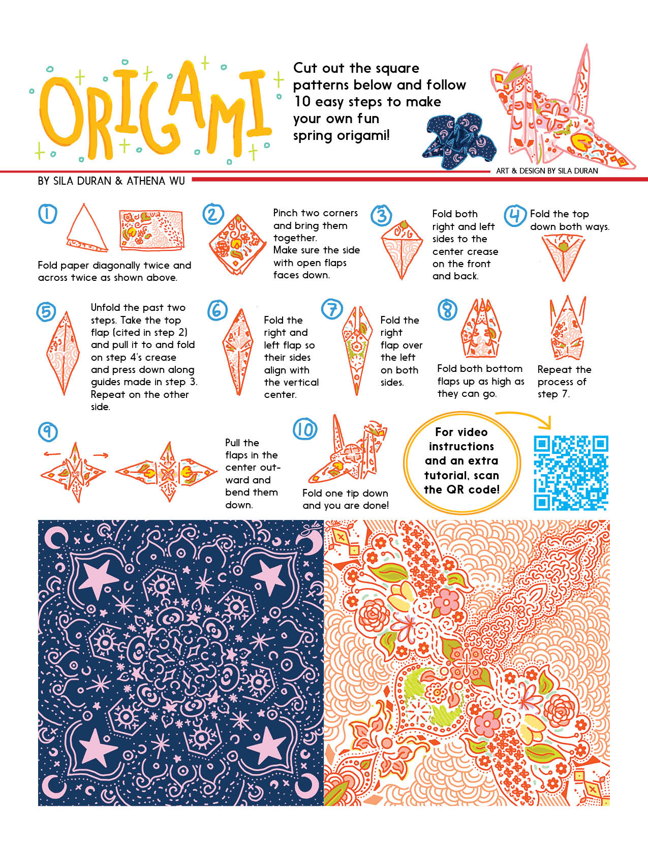
Origami
West Side Story Volume 54 Issue 5, April 22, 2022
I adore origami, so I was ecstatic when I got the opportunity to share my love of origami through instructional design. My process started with making the pattern of the square origami paper – located at the bottom of the page for readers to cut out. I then printed these myself to fold mock-ups, which I could then use as references for my illustrations of each step. I did this to ensure that when someone is going through the steps, not only will the general shape of the paper match up with what’s in-front of them, but the pattern will line-up as well.
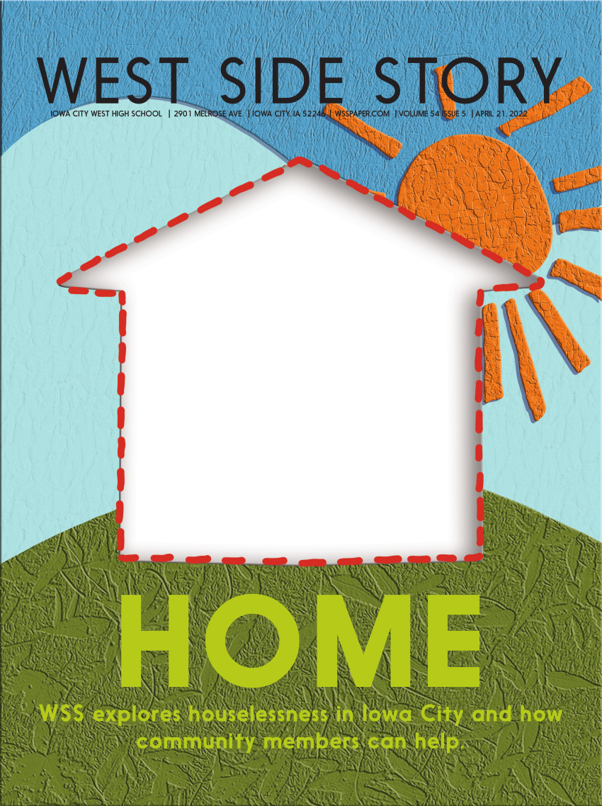
Cover - Home
West Side Story Volume 54 Issue 5, April 22, 2022
I wanted Home to frame the topic of homelessness and houselessness in an approachable manner, so students may be encouraged to participate in solving this problem. This is why I made this cover design reminiscent of a children’s book that incorporates a visual story unfolding in each spread. I purposefully made the characters look like teenagers so our mainly high-schooler audience would be able to relate and empathize with the homeless/houseless population. I also tried to incorporate stylized versions of places from around our city – like the buildings downtown and the Iowa Memorial Union Walking Bridge – to illustrate how local and real this problem is within our own community.
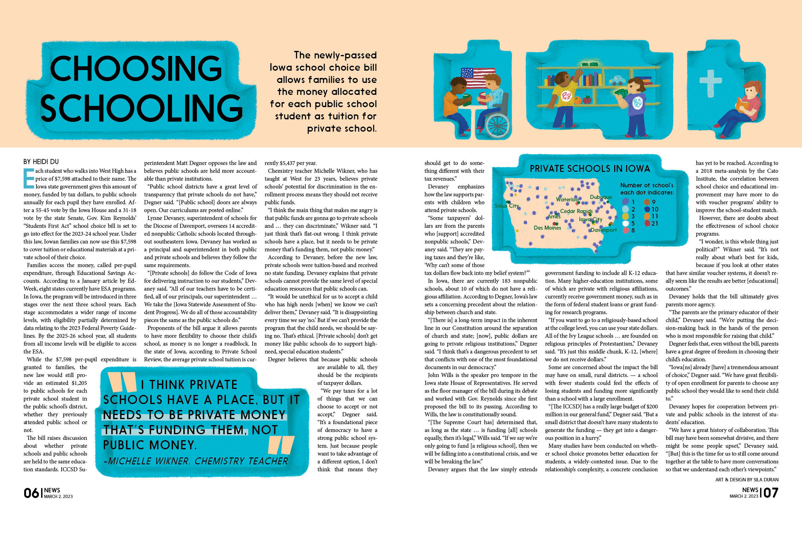
Choosing Schooling
West Side Story Volume 55 Issue 4, March 2, 2023
Choosing Schooling needed all the room it could get to unpack everything this bill entailed and its potential ramifications. Consequently, my goal was to use the little space I had effectively to communicate and represent this complexity in my illustrations as well as deliver additional content via the infographic.
I also got the opportunity to add to the original infographic I made for this spread by making it more dynamic for the article posted on our website, which can be viewed here.
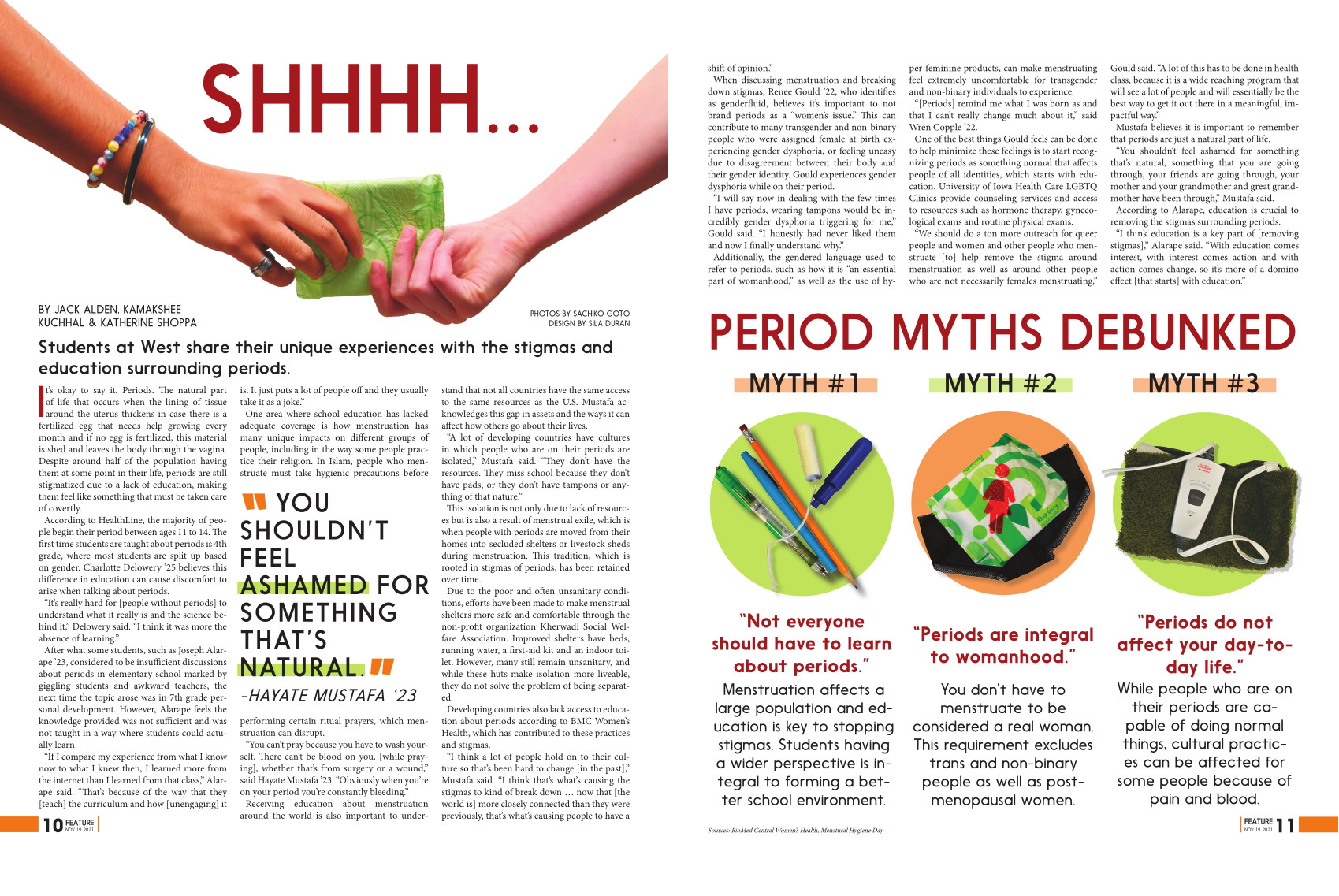
SHHHH...
“SHHHH…” is a double page spread I made for my school’s news magazine about the stigma of periods at West High. I directed (and modeled in) the photograph of the two hands to be reminiscent of The Creation of Adam, to reflect a period’s role in the creation of life as well as present a modern and casual twist. I purposefully used shapes and colors to create a simplicity, light spirit, and approachability to welcome readers to the article. I avoided over-using colors like pink and red since I thought they would reinforce a shallow representation of periods: lots of blood and only relevant to girls. This design has won an Honorable Mention for its Infographic and as a News Magazine-Multiple Page Design in the 2022 Iowa High School Press Association Spring Journalism Contest.
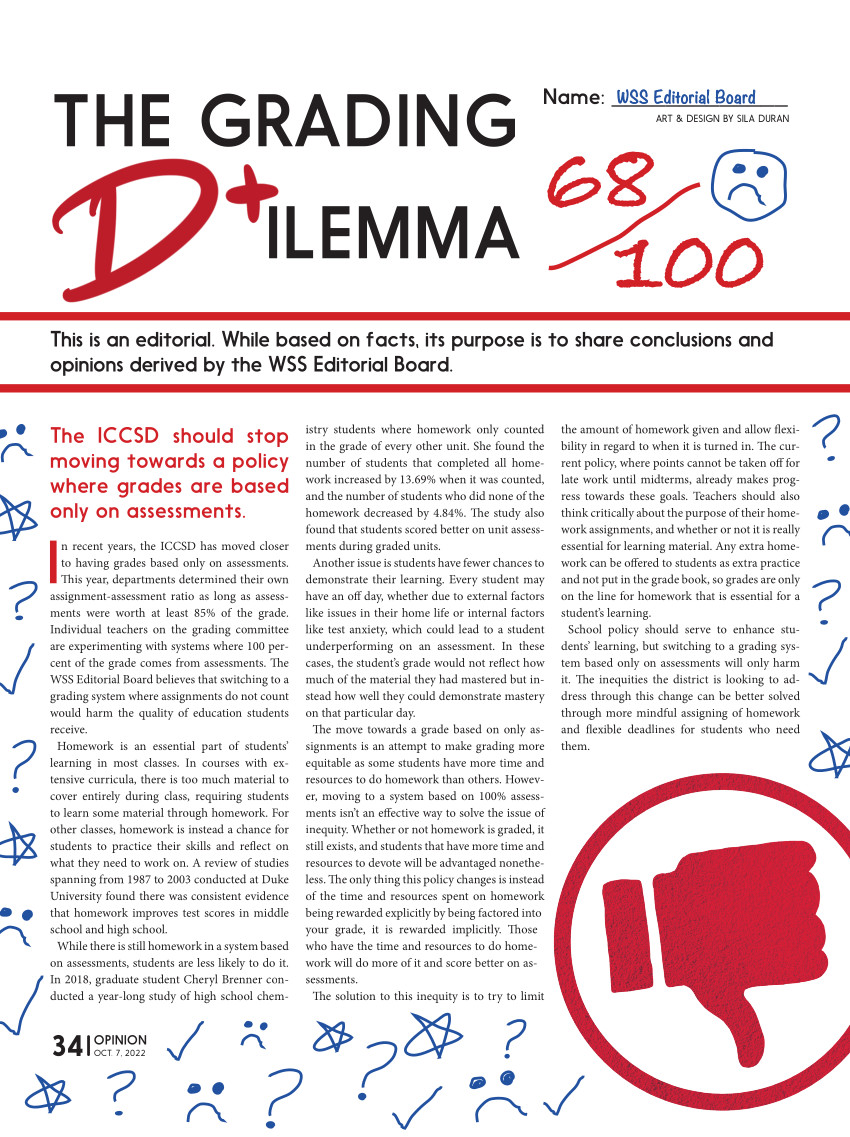
The Grading Dilemma
West Side Story Volume 55 Issue 1, October 7, 2022
I wanted the layout of The Grading Dilemma to symbolize an assignment that had been given a bad grade. My reason for doing this was so getting the readers understand the topic before even reading a single word by virtue of the design being reminiscent of a student’s daily work. Additionally, I added playfully dramatized annotations hypothetically made by teacher and student.
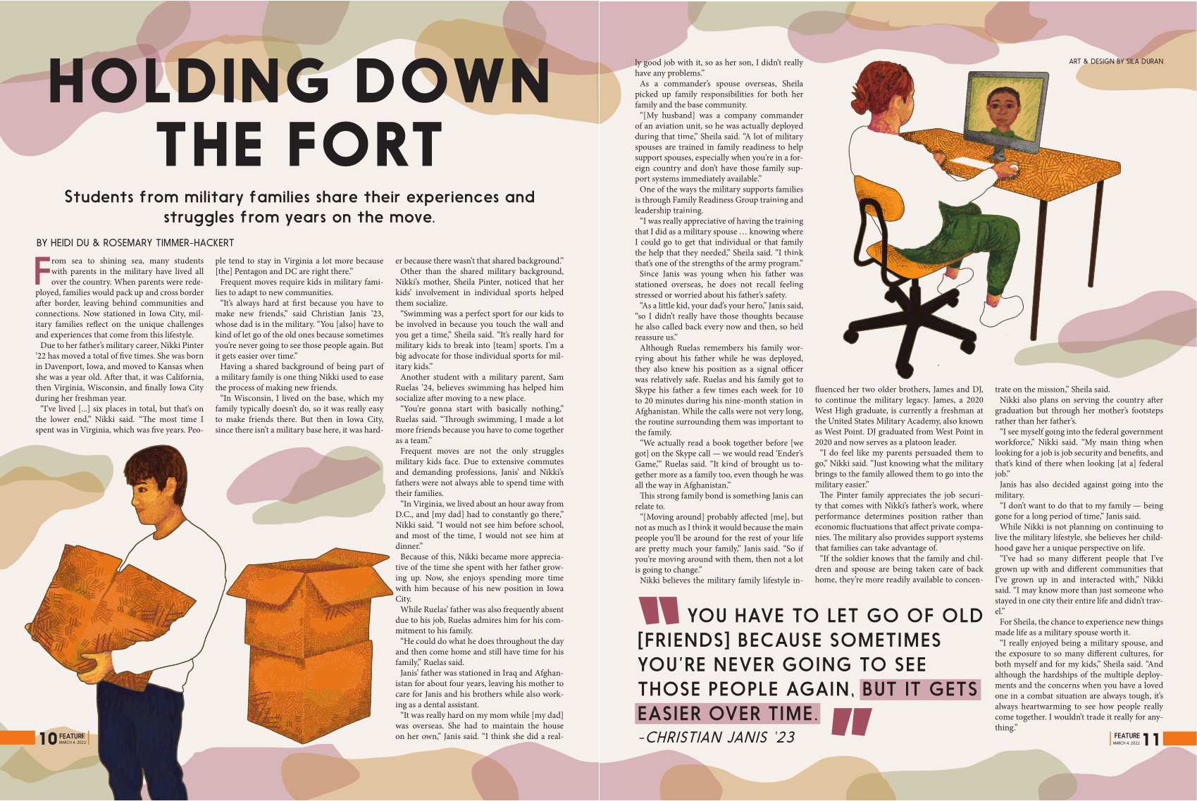
Holding Down the Fort
“Holding Down the Fort” is a double page spread I made for my school’s news magazine centered around kids in military families at West High. The art is meant to illustrate how moving from place to place affected their ability to be fully realized people, as large chunks of their portraits are left unfinished.