Rising Stars
West Side Story Volume 55 Issue 4, March 2, 2023
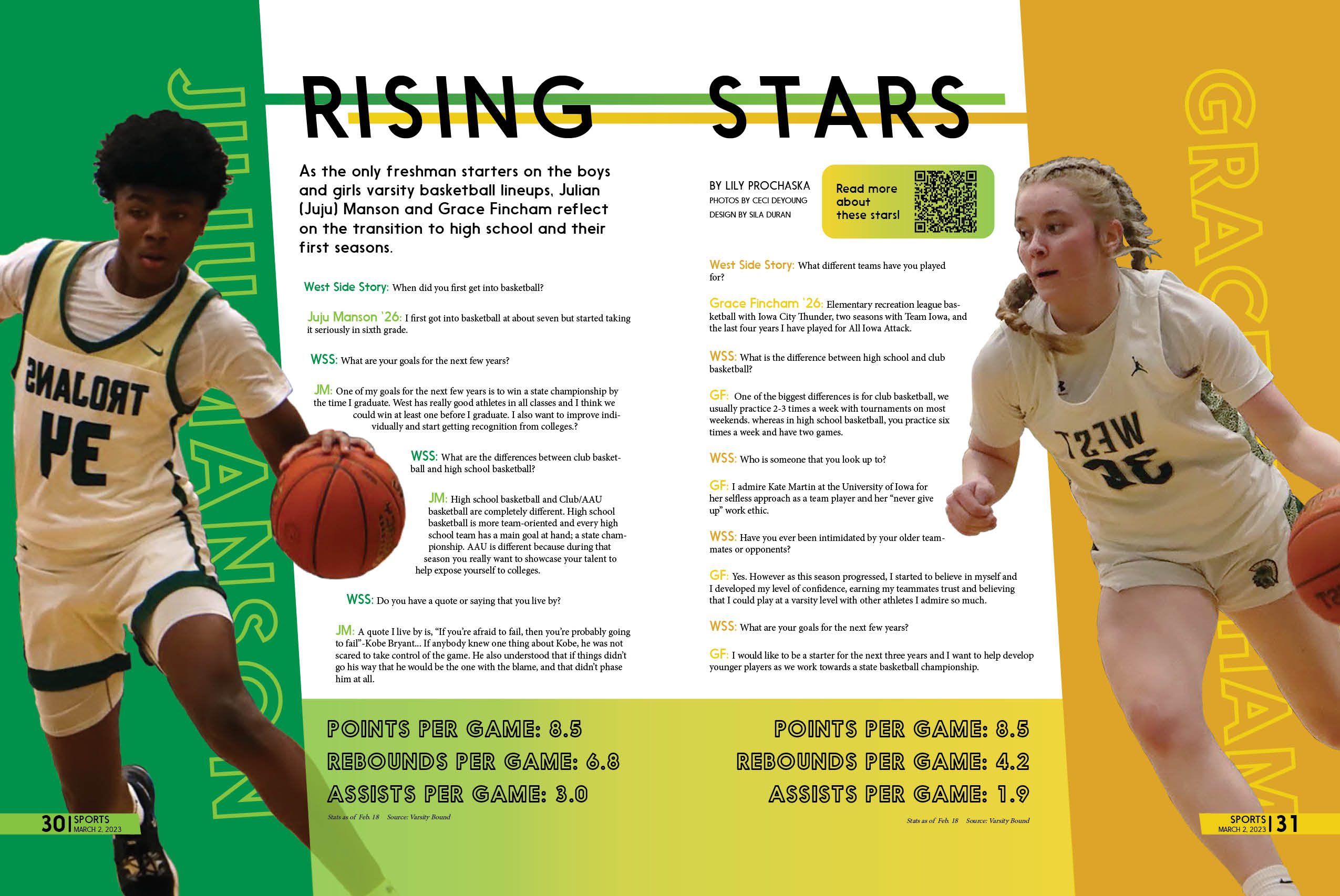
I wanted to create an engaging and dynamic design that will get every readers’ attention. I did this through using slanted shapes, words, and lines to highlight and emphasize the movement and adrenaline of the players captured in their action photos.
Also playing off of our school colors– green and gold– is a must.
Additionally, I got the chance to recreate this sense of movement something dynamic in the infographics and photo feature I made for our website, which can be viewed here.
